Design without borders, for borders
Balancing traveller experience, government requirements, and platform scalability.


Background
Mobile Travel Authorisation (MTA) is a white-label mobile app developed by SITA Australia and sold to national governments to manage electronic travel authorisations. Each deployment needed to balance country-specific border regulations and branding with commercial scalability and usability for a wide range of travellers.
Role
Internal UX Designer embedded in a newly formed SCRUM team, shaping end-to-end experience and accessibility.
Timeline
May 2024 – Dec 2025 (my involvement)
Core challenge
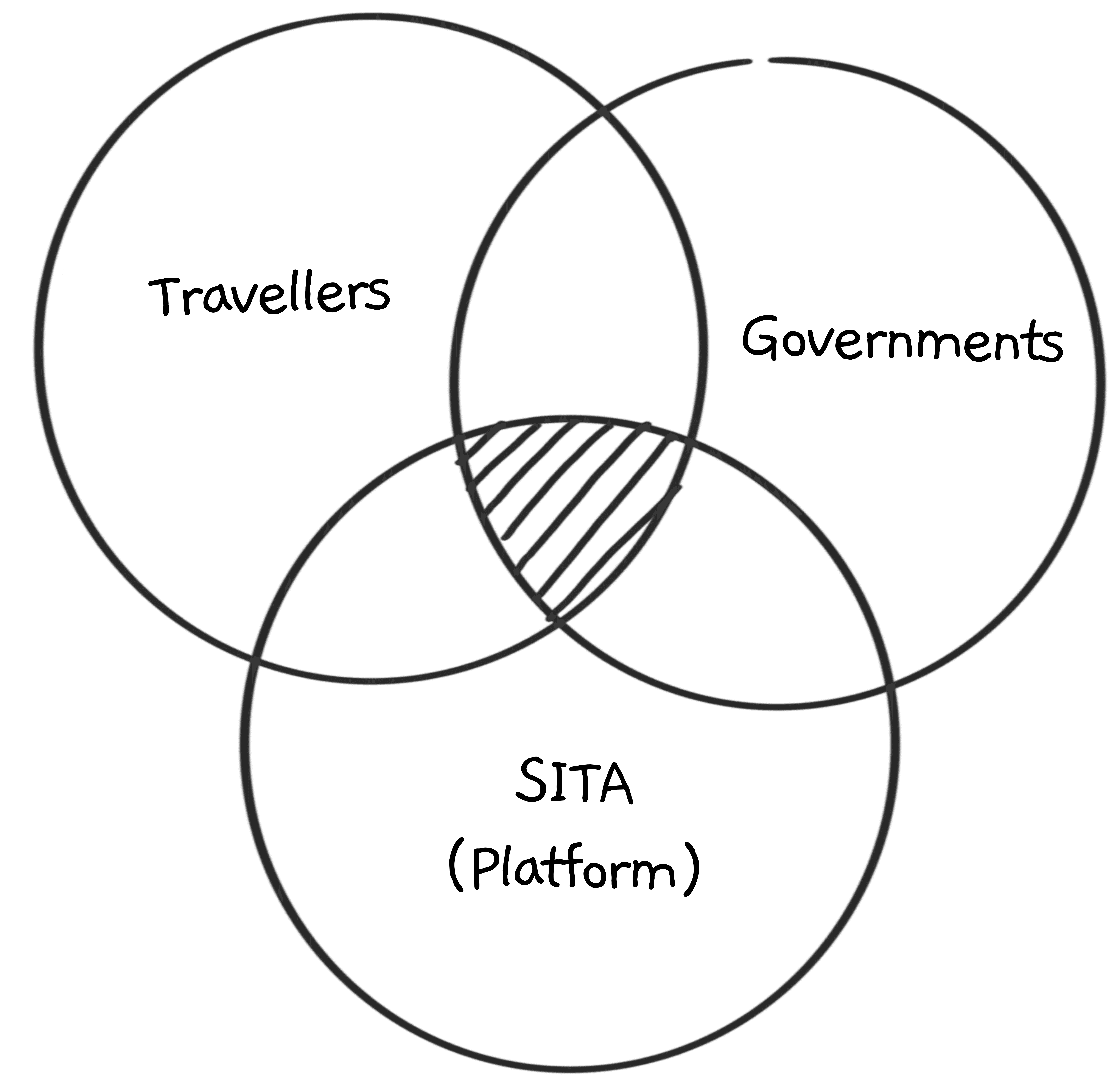
How might we design a single, coherent mobile experience that reconciles the needs of travellers, SITA as a platform provider, and sovereign governments — each with their own constraints, priorities, and definitions of success — without allowing any one of these to dominate the experience to the detriment of the others?
Impact
Launched successfully for Peru, delivered measurable impact within the first month:
44%
reduction in airport kiosk reliance
37%
e-gate adoption driven
4.8 / 5
from 12,552 user downloads
1.8x
improvement in delivery workflow efficiency pre-launch
The launch was recognised through official government communications and press coverage, and the product is publicly available on the Google Play Store.
The modular system created reduced development and QA overhead, enabling faster rollout for subsequent countries (including Kenya) while preserving traveller clarity, accessibility, and platform scalability.
Context & Stakes
MTA was conceived as a white-label mobile product that SITA Australia could sell to multiple national governments, each with their own border regulations, branding requirements, and occasional feature requests. While the experience needed to remain simple and coherent for travellers, the underlying system also had to support country-specific legal, operational, and branding requirements — without fragmenting the product or limiting its commercial scalability.
The stakes were therefore multi-layered:
If travellers lacked clarity or confidence in this high-consequence process, the product would fail at a human level.
If governments’ requirements weren’t met, the product couldn’t be sold or approved.
If the system couldn’t scale, SITA’s commercial model would collapse.
The challenge was not just designing a usable experience, but ensuring it could survive across political, regulatory, and organisational boundaries.
The Real Problem
The initial brief framed the work as a UI and accessibility refresh while aligning it with SITA’s latest branding — effectively, to “make it look nicer and more modern.”
But usability alone was not the core challenge.
The real problem was how to design a single, coherent experience that could reconcile the needs of travellers, SITA as a platform provider, and sovereign governments — without allowing any one of these to dominate the experience to the detriment of the others.
Reframing the problem this way shifted the work from designing screens to mediation: translating regulatory, commercial, and organisational complexity into something humans could navigate with clarity and confidence.
Key Challenges & Constraints
I joined the project mid-stream, inheriting an existing design alongside a single accessibility audit report from the previous work. While a full SCRUM team was still being assembled, delivery expectations were already in motion.
Although the project eventually settled on a six-month delivery window, the timeline shifted repeatedly and could change at short notice. Commitments to the first client country (Peru) had been made by the sales team before delivery teams were fully aligned, creating sustained pressure across product, design, and engineering. With no existing user research and a volatile timeline, there was limited opportunity to conduct comprehensive research before delivery.
Several constraints shaped how the work had to progress in practice:
Designing in ambiguity
Business requirements were unstable and often incomplete, as the product owner was still learning the domain and delivery process.
Circular dependency between product, design, and development
User stories depended on design clarity, while design decisions depended on requirements that were still forming, and delivery depended on design to move forward — leaving progress effectively blocked unless design stepped in first.
No budget for formal usability testing
Validation had to rely on alternative methods rather than structured research.
Compressed and unstable timeline
Progress had to continue despite uncertainty, with limited room for rework.
Designing with multiple countries in mind from the outset
While delivering initially to Peru, the product needed to remain adaptable for future country deployments.
These conditions meant that following a linear or idealised design process was not feasible. Progress had to be made in parallel with ambiguity.
Approach and Key Decisions
Decision 1 —
Designing for humans amid ambiguity
Decision 1
What I was facing
There were no stable business requirements, no existing user research, and a delivery timeline that could shift at short notice. Design could not wait for full clarity, yet early decisions still needed to support a wide range of travellers and remain accessible by default.
At the same time, travellers were being asked to complete a high-consequence process, often under time pressure, with little tolerance for confusion or error.
Decision 1
What I chose to do
Rather than reacting screen by screen to incomplete inputs, I focused on establishing a human-centred baseline grounded in clarity, expectation-setting, and cognitive load reduction. Beyond baseline visual and accessibility considerations, I prioritised structural decisions that shaped how travellers understood and navigated the process as a whole.
Decision 1
Establishing a human-centred baseline
To anchor decisions amid ambiguity, I created two bookend personas — a first-time traveller and a frequent traveller. In the absence of formal research, these personas were informed by secondary research, role-playing, and conversations with travellers to ground decisions in real behaviours. They helped frame trade-offs around confidence, predictability, speed, and accessibility, ensuring the experience could support both ends of the spectrum without fragmenting the flow.
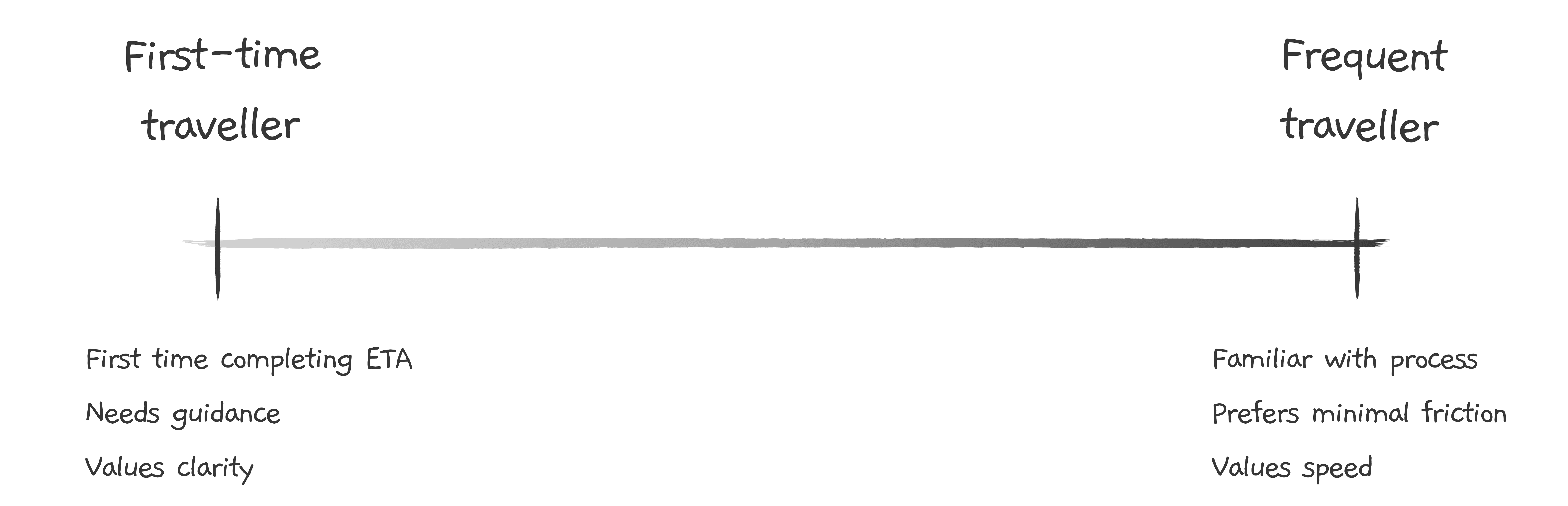
The experience was shaped to support a spectrum of familiarity — from first-time travellers to frequent travellers.
Decision 1
Making the process explicit upfront
A key decision was to make the entire application process visible before users began. The existing design relied on breadcrumbs embedded within individual screens, which competed for screen real estate and did not scale well for countries with longer or more complex processes.
I replaced this with a dedicated application checklist presented as its own screen, allowing travellers to understand what laid ahead before committing to the process. This also created space to introduce step-level progress indicators within individual tasks, reinforcing clarity and orientation throughout the journey.
Before
After
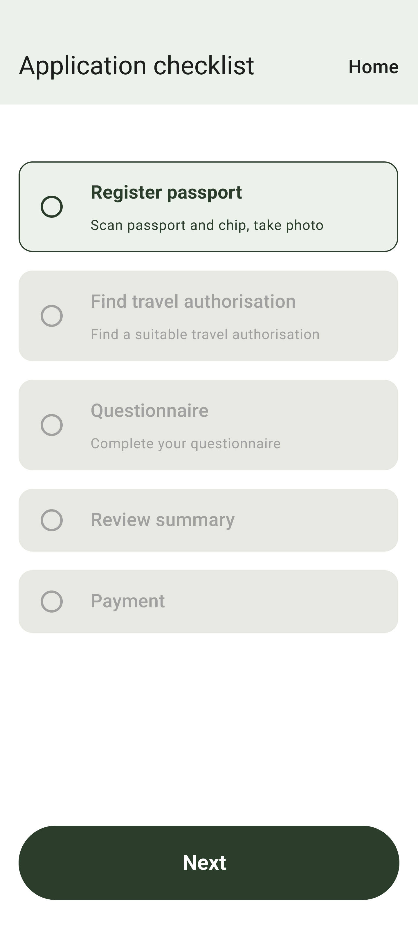
Replacing embedded breadcrumbs with upfront process transparency.
Before
After
Reinforcing orientation within each step of the journey.
Decision 1
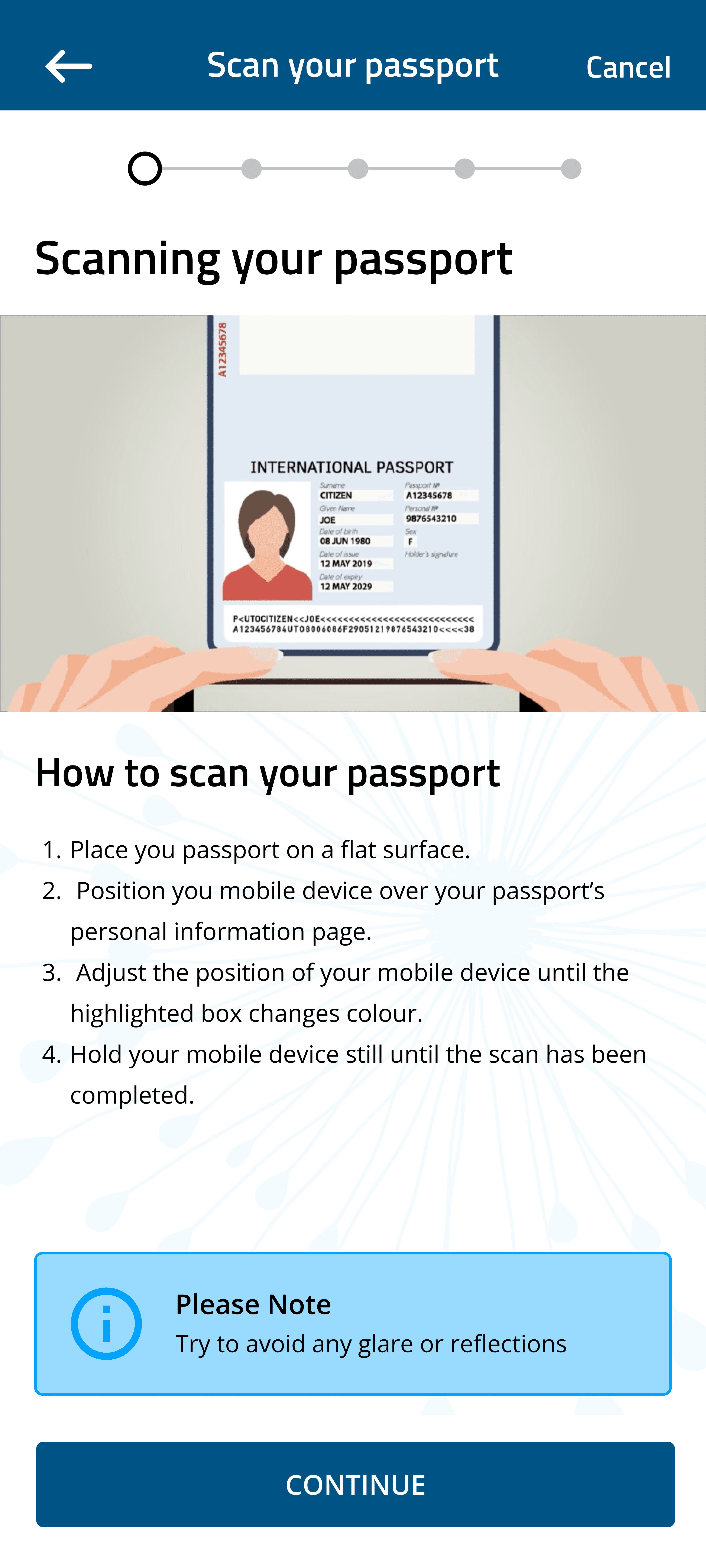
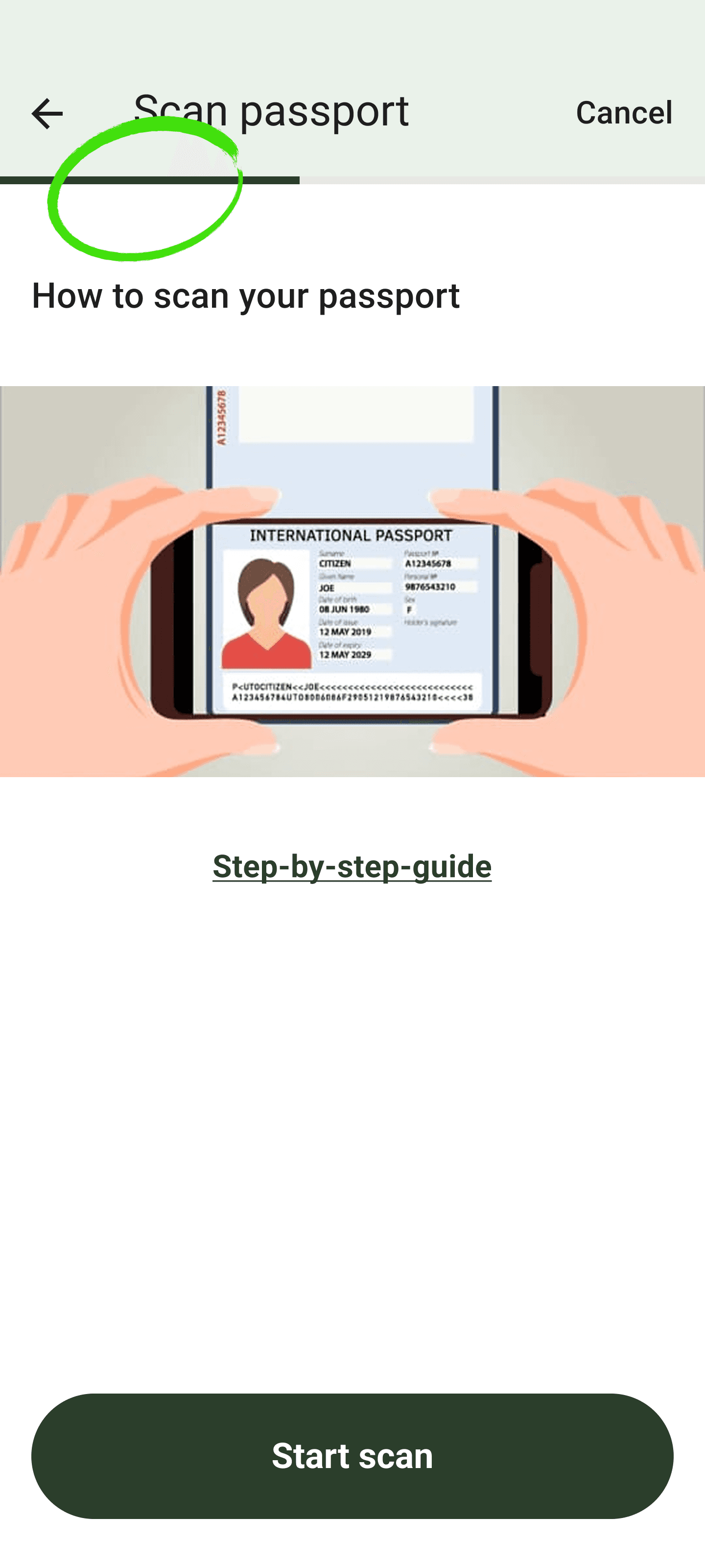
Reducing cognitive load within steps
With the overall process made explicit, I focused on reducing complexity within each step. Instruction-heavy content was progressively disclosed, ensuring guidance was available when needed without overwhelming users who were already familiar with the process.
Using the same task flow, frequent travellers could move quickly, while first-time travellers could access reassurance and explanation without increasing cognitive load for either group.
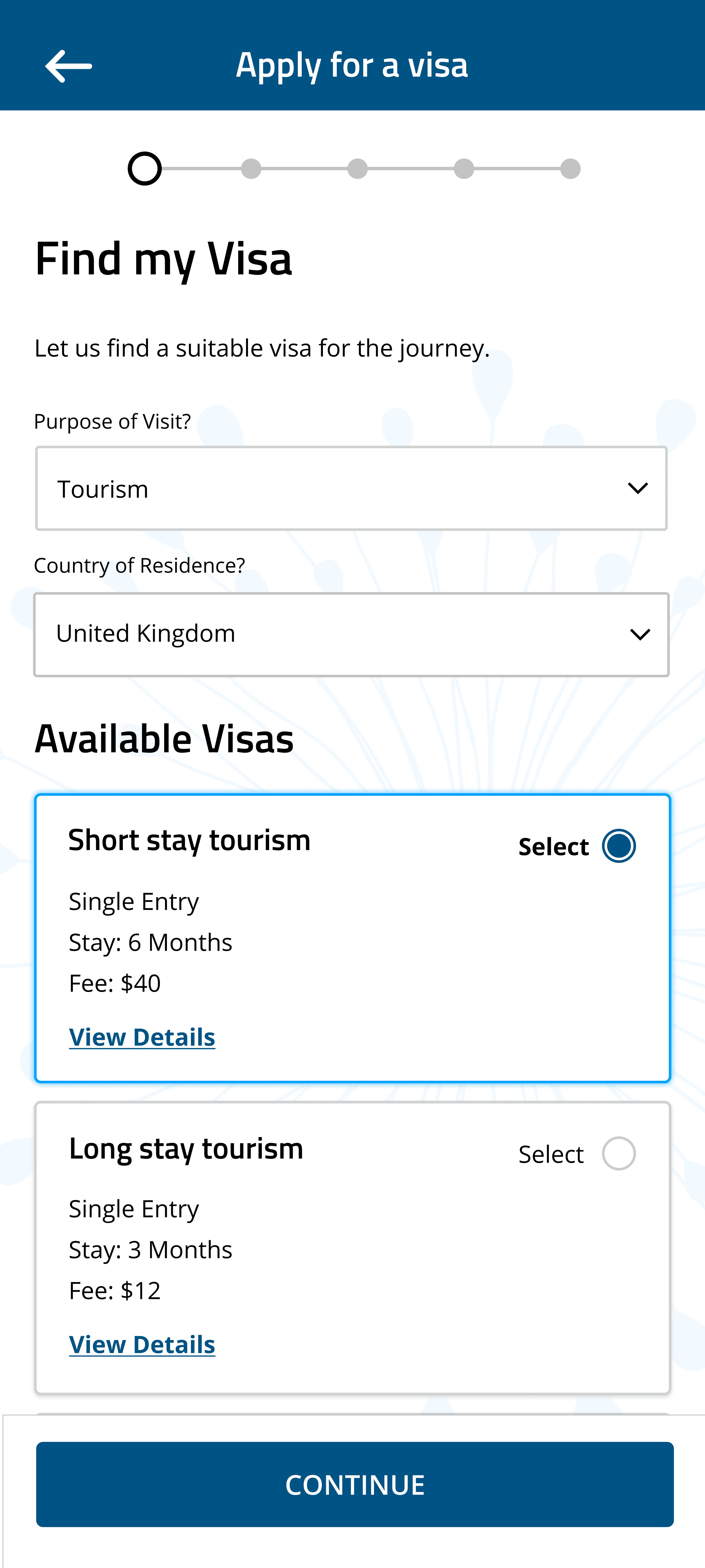
The same principle extended to structural changes in other task flows. For example, the original “Find Visa” experience combined search input and results within a single screen. I separated this into distinct steps — search and results — allowing users to focus on one action at a time and reducing cognitive load during decision-making.
Before
After

Allowing guidance and speed to coexist within a single experience.
Before
After


Structuring tasks into focused steps to lower cognitive burden.
Decision 1
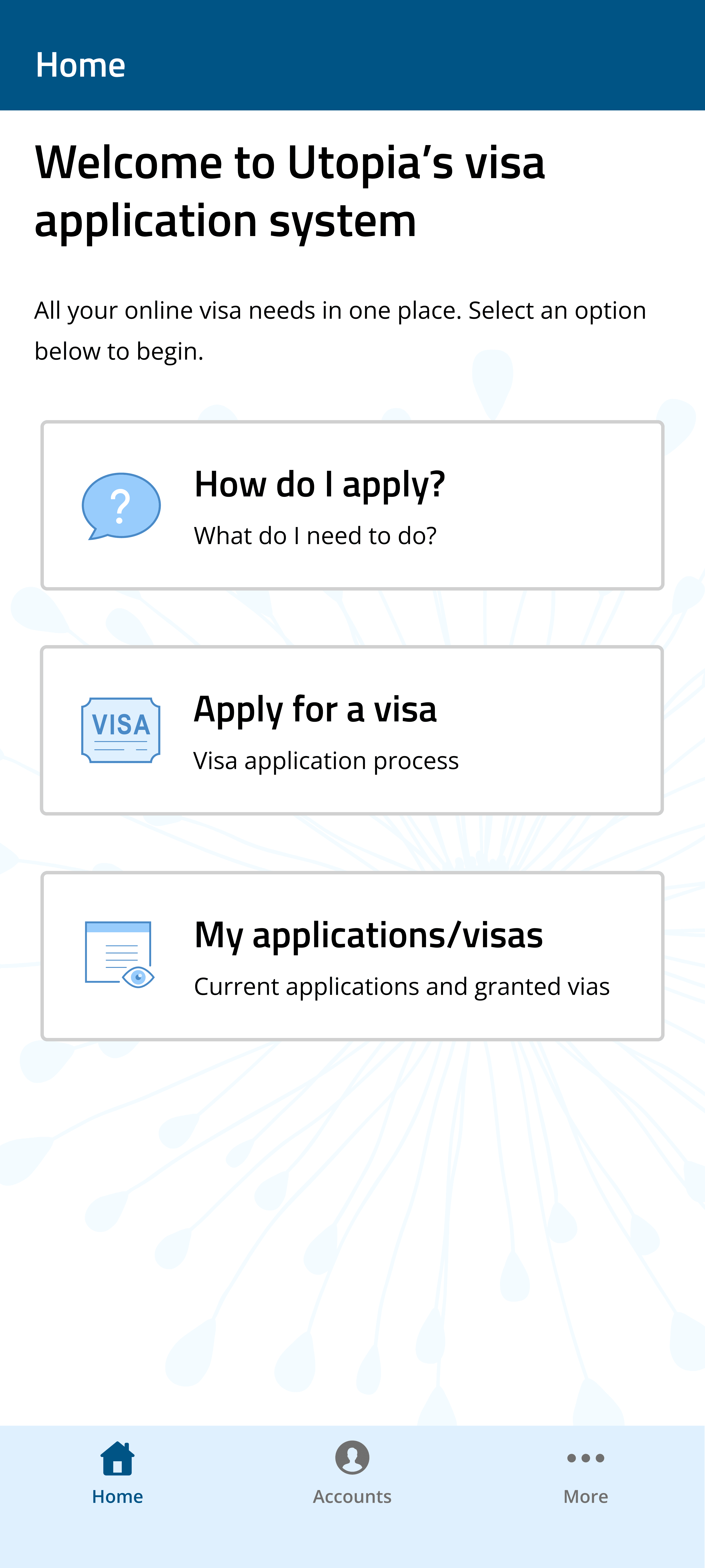
Aligning navigation with user intent
Finally, I restructured the home screen to align with user intent rather than system states. The previous design presented parallel entry points — “How to apply,” “Apply for visa,” and “My applications / visas” — creating competing paths and redundant states.
I centred the experience around a single action that reflected the user’s primary goal: applying for a visa. In line with SITA’s terminology, “visa” was renamed to Travel Authorisation (TA). Status information was surfaced directly on the home screen, treating applications as travel authorisations in progress rather than separate entities.
Secondary flows, such as guidance and settings, were intentionally tucked behind progressive entry points to reduce cognitive clutter while keeping support accessible when needed.
Before
After


Aligning navigation with user goals rather than system states.
Decision 1
Why it mattered
By anchoring early decisions in human sense-making rather than unstable requirements, design could move forward despite ambiguity. Making the process explicit and structured reduced anxiety for travellers, established a resilient foundation for future country-specific variations, and allowed later business, policy, and technical requirements to be layered on without destabilising the experience.
Decision 2 —
Prioritising functional clarity to enable confident delivery
Decision 2
What I was facing
As delivery began, the primary challenge was shipping a working product within a volatile timeline without creating unnecessary rework. With limited certainty around future requirements, design effort needed to be carefully prioritised while making deliberate trade-offs.
The product still needed to be usable and accessible, but there was neither the time nor clarity to fully polish the interface upfront. Early decisions would directly impact delivery speed, developer workload, and future flexibility.
Decision 2
What I chose to do
I aligned early with the product owner and scrum master that the product would continue to evolve across later sprints. With that assurance, I focused the initial release on clear, understandable flows, deliberately deferring detailed UI polish until after the initial release, when refinement could be informed by real-world use.
Step 1
Stabilise core flows and experience
Step 3
Step 2
Initial release
(Ship to Peru)
Step 2
Step 3
Visual refinement and system scalability
Delivery sequencing prioritised clarity first, stabilising core flows and experience before release and allowing later refinement to focus on visual and system evolution.
To support faster development, I designed using Material Design components rather than creating custom components from scratch. This reduced development overhead, ensured baseline accessibility, and maintained consistency without introducing unnecessary complexity.

01
Progress indicator
Adapted to indicate step progression
02
Chip
Adapted as a static contextual label
03
Text field (disabled)
Indicates read-only information
04
Button (disabled)
Indicates readiness to proceed
Leveraging and adapting existing components to balance delivery speed with clarity, consistency, and accessibility.
Rather than finalising designs in isolation, I involved developers early in design discussions to validate feasibility, surface constraints, and negotiate trade-offs together. By explicitly asking whether designs were implementable and adapting early where needed, decisions were made collaboratively rather than deferred downstream.
I also worked closely with QA during testing, flagging discrepancies between the intended and implemented UI to reduce rework and ensure the shipped experience matched the design intent.

Mockups

Figma
Major design difference (mostly affects business requirements and UX flow)
Difference in padding size, font size/weight, border colour/thickness, shadows
Design changes made during UI review
Need a new ticket
Difference in code implementation
Structured UI-to-build reviews to help surface discrepancies early, align implementation with design intent, and reduce downstream rework.
Decision 2
Why it mattered
This approach enabled the team to ship within a volatile timeline while maintaining a usable and accessible experience. By prioritising functional clarity over visual polish, we reduced delivery risk, avoided costly rework, and created space for refinement in later iterations without compromising the core experience.
Decision 3 —
Stepping in to stabilise the system and restore momentum
Decision 3
What I was facing
As delivery ramped up, progress across the team became increasingly constrained by a circular dependency between product, design, and development. User stories depended on design clarity, while design decisions depended on requirements that were still forming, and development depended on both to move forward — creating a system where progress stalled without a stabilising structure.
In practice, this meant the product owner was waiting on design to clarify flows, developers were waiting on design to proceed with implementation, and delivery momentum stalled whenever ambiguity surfaced.
Decision 3
What I chose to do
Rather than limiting my role to producing designs, I stepped into a mediation role to help the team move forward by thinking beyond individual screens, treating the product as a system, and stabilising the underlying flow structure.
To create momentum amid uncertainty, I proactively mapped user flows, clarified assumptions, and pre-designed screens ahead of formal user stories, establishing a clear product flow architecture so development could continue without waiting for perfect inputs. This stabilised a core flow structure that could adapt as requirements evolved, supporting the product owner with concrete artefacts to shape requirements while giving developers enough structural clarity to progress with confidence.
Alongside this, I worked closely with developers to clarify flows and assumptions in real time, ensuring delivery could continue even as requirements were still forming.
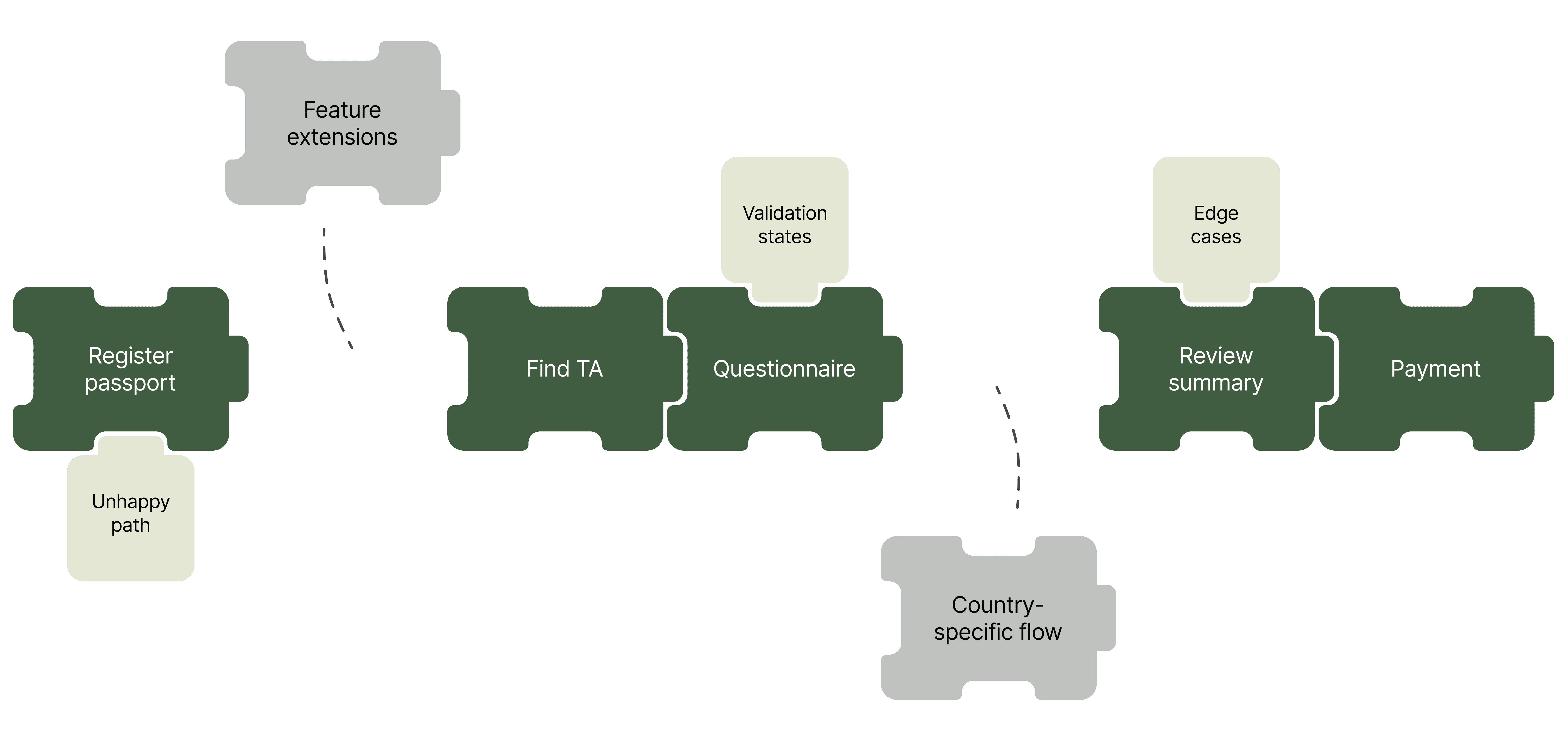
Core flow
Supporting logic
Adaptive layers
A stabilised yet adaptable core flow enabled progress amid evolving requirements, supporting country-specific variations without disrupting the experience.
Decision 3
Why it mattered
By stabilising the underlying flow structure and breaking the circular dependency between product, design, and development, delivery regained momentum. Developers no longer had to wait on fully formed requirements to begin work, and the product owner was able to refine stories based on tangible design artefacts.
Establishing a stable yet adaptable backbone also created a structural foundation for future evolution, making it easier to layer refinements, extensions, and country-specific requirements without disrupting the core experience.
Over time, this approach helped establish design as a trusted delivery partner rather than a downstream function — reflected in increased confidence from engineering, smoother collaboration across the team, and a more resilient product architecture.
Decision 4 —
Systemising the experience for multi-country scale
Decision 4
What I was facing
MTA was designed to scale across multiple national deployments. While the first release to Peru validated the core experience, informal usability testing revealed opportunities to improve clarity before scaling further.
With Kenya confirmed as the next deployment, continuing without a formalised system risked duplicated effort, inconsistent patterns, and increasing development overhead as country requirements diverged.
Decision 4
What I chose to do
Rather than redesigning the product independently for each country, I formalised the refined core flows into a modular design system before beginning work on Kenya.
Decision 4
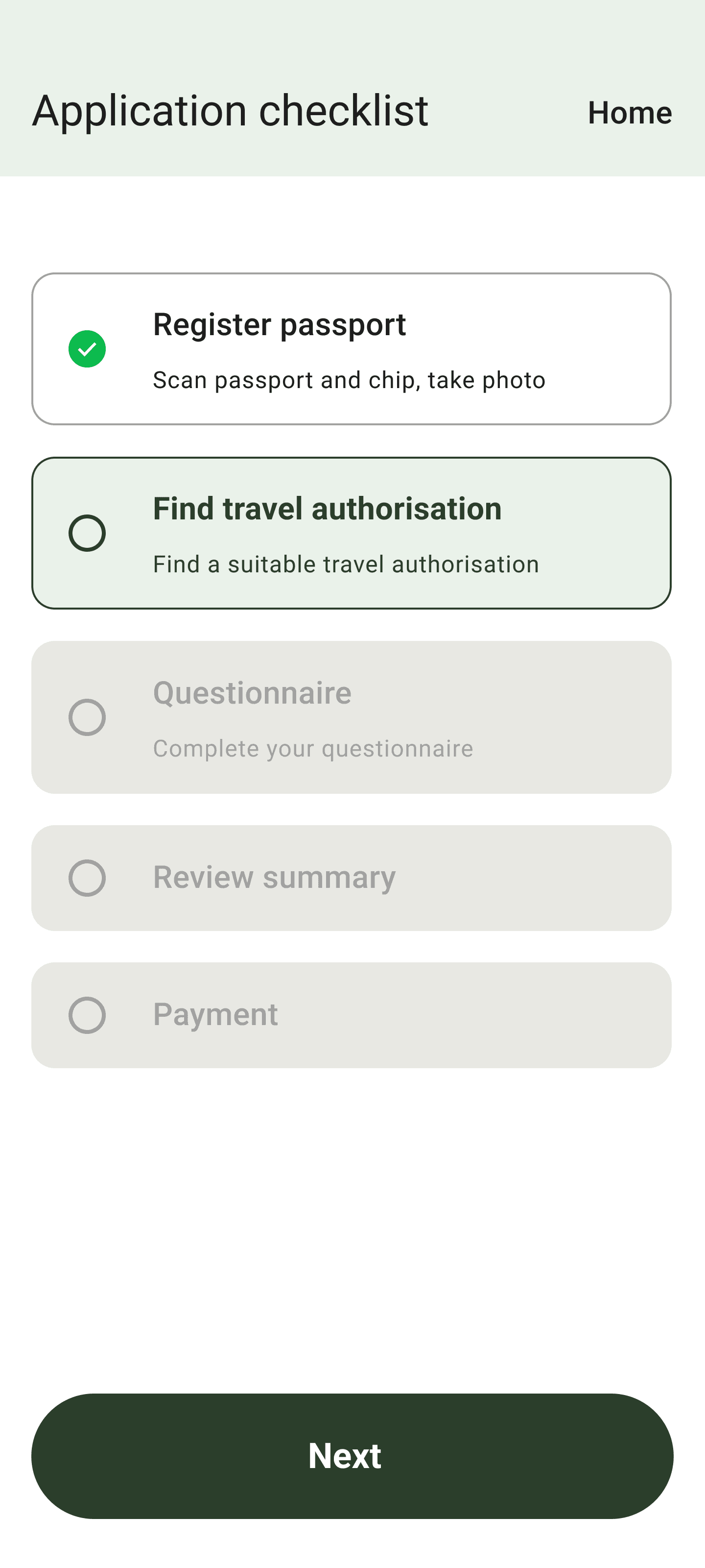
Refining based on usability feedback
Informal usability testing conducted within our own networks after the Peru release surfaced two clarity gaps. Users initially mistook checklist items for interactive controls due to their resemblance to radio buttons, and some were unsure what to do after submitting an application, with no visible pathway to guidance or contact.
While the underlying flow was working as intended, these findings highlighted areas where the interface required refinement before scaling the product further.
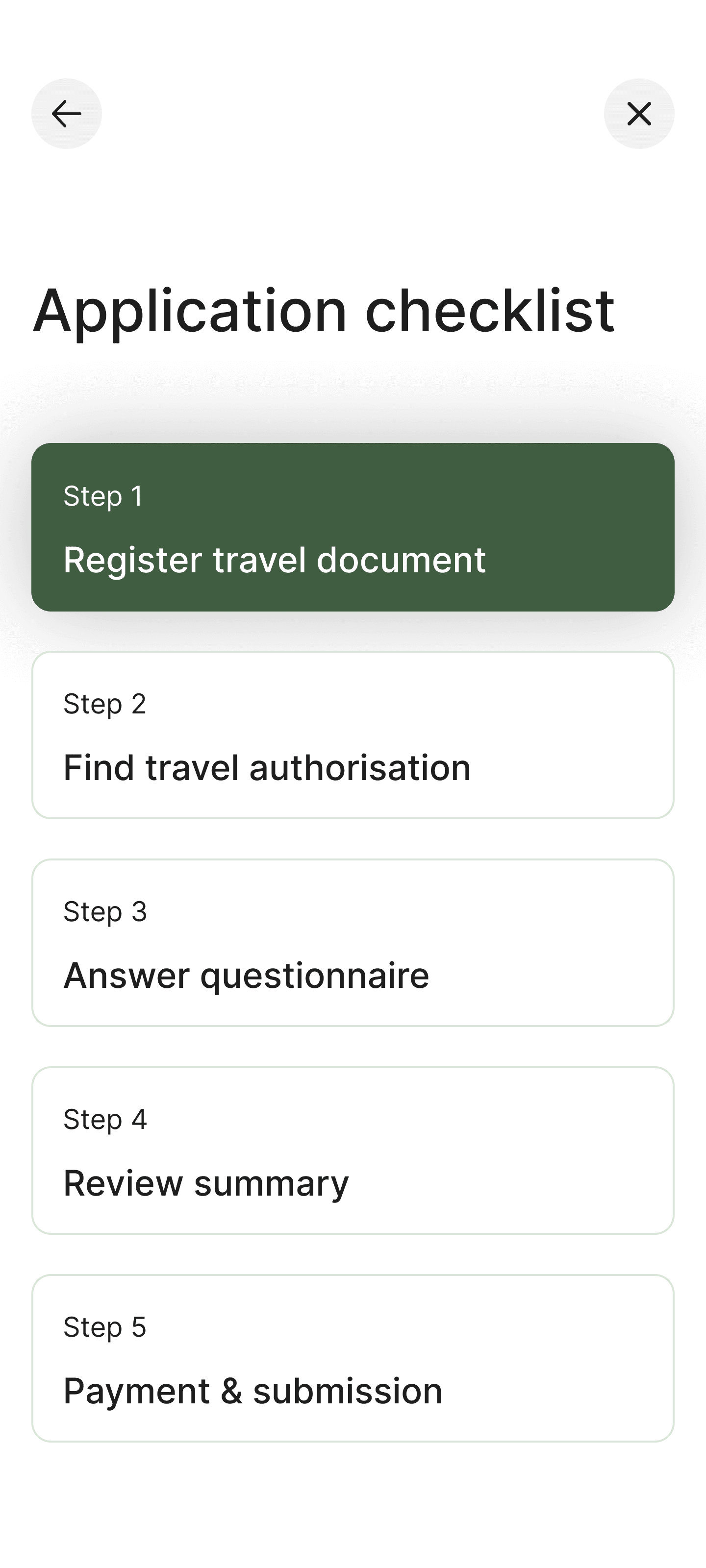
I redesigned the checklist as an actionable step navigator. Each step became a button with three states — completed, next task, and upcoming steps — allowing travellers to clearly understand their progress while maintaining a predictable interaction model.
Before
After

Transforming the checklist into an actionable step navigator, using state-based buttons to communicate progress and guide task completion.
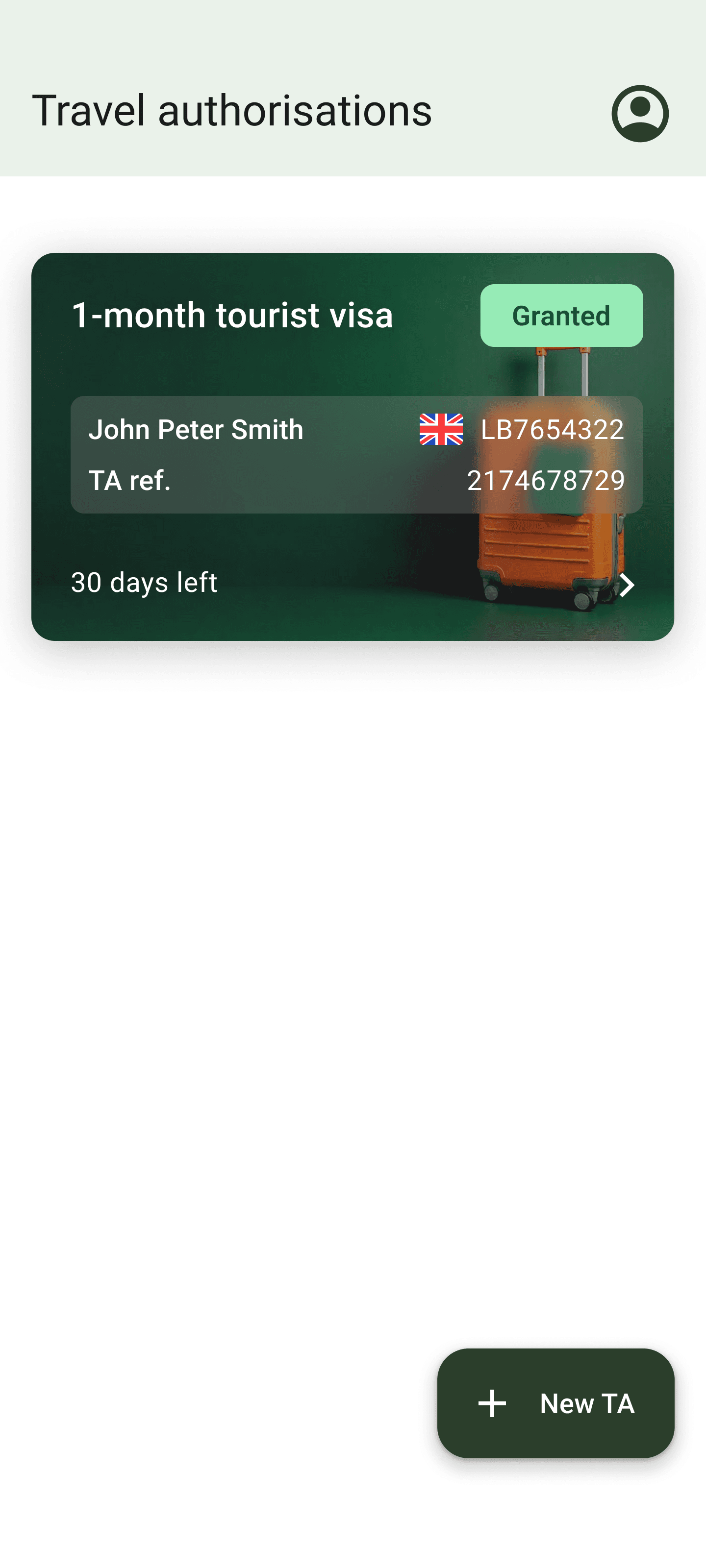
On the home screen, I evolved the earlier decision of hiding secondary flows by introducing configurable quick links, allowing countries to surface relevant guidance or support pathways without increasing structural complexity.
Before
After
Introducing configurable quick links to surface guidance and support pathways while maintaining a clean primary entry point.
Decision 4
Defining the modular system
With these refinements validated, I translated the improvements into a modular system defining:
Consistent layout patterns
Standardised questionnaire components
Rule-based interaction patterns based on question type
Brand tokenisation for scalable theming
This preserved a coherent core experience while enabling country-specific requirements to layer on without fragmenting the product.
Decision 4
Foundation layer
Typography, spacing, and colour were formalised into reusable tokens to establish a consistent visual foundation across the product.
Standardising these elements ensured layouts remained predictable and accessible across screens, while giving developers a clear set of reusable primitives to build from.
COLOUR
colour-primary-500
colour-primary-400
colour-primary-300
colour-primary-200
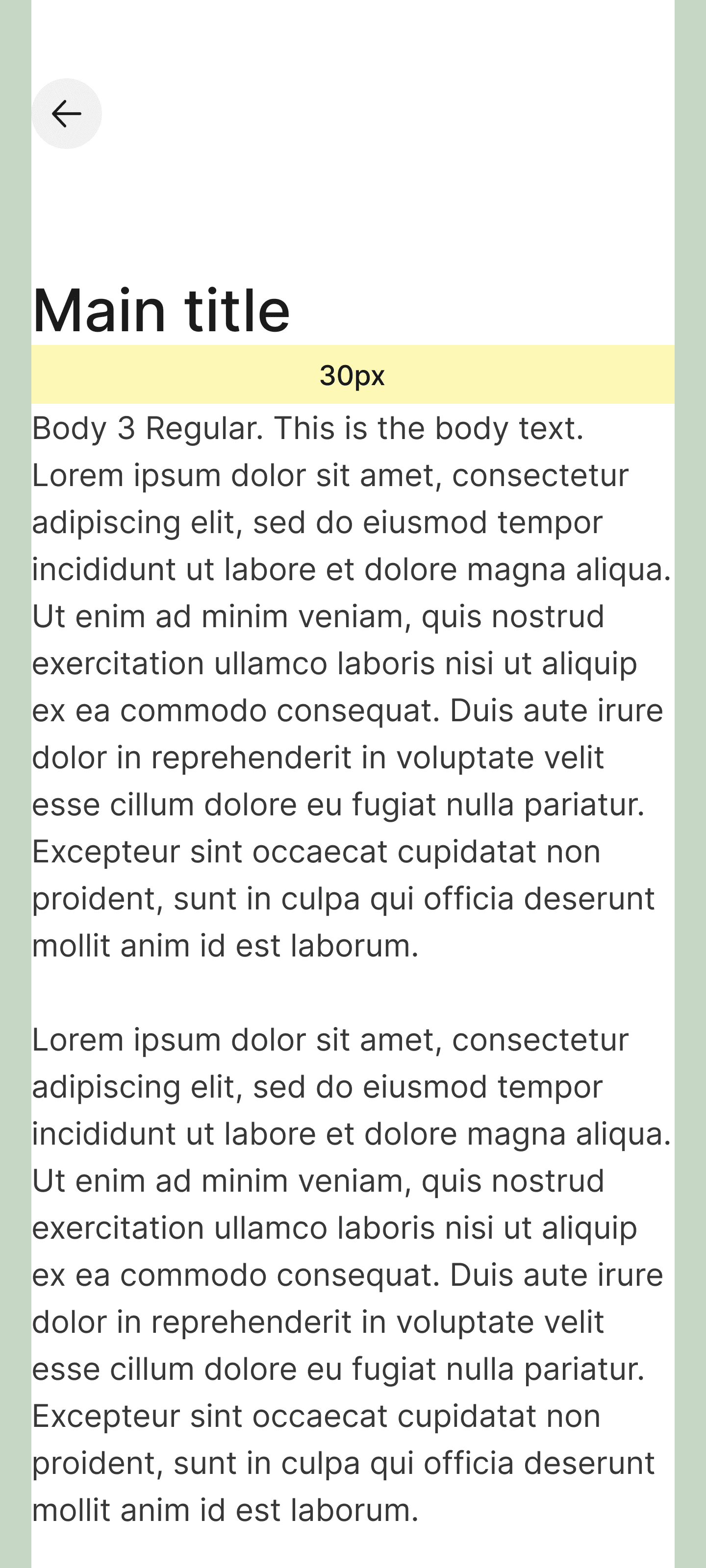
TYPOGRAPHY
Main title / 30 / Medium
Subtitle / 14 / Regular
Body 3 / 16 / Regular
Interactive / 16 / Medium
SPACING
14px
30px
40px
50px
INTERACTIVE
Button
Step n
Name of task (Current)
Selected
Core visual tokens and layout primitives were formalised to ensure consistency, accessibility, and reusable implementation across the product.
Decision 4
Pattern layer
Building on the modular backbone stabilised earlier, I translated that architecture into reusable interaction patterns and layout rules that could accommodate the varying data requirements of different countries.
Because each country has its own legal requirements and questionnaire structures, the interface needed to accommodate variation without introducing new interaction behaviours for travellers.
Decision 4
Layout framework
A consistent spacing and layout framework established predictable visual rhythm across screens, ensuring clarity regardless of content structure.
Informational
Questionnaire

A standardised layout framework established consistent visual rhythm across both informational and questionnaire screens.
Decision 4
Question interaction patterns
On top of this foundation, questionnaire patterns were defined to handle different input scenarios — including simple selections, composite questions with nested inputs, and expandable forms for additional details.
This allowed complex regulatory requirements to be captured within a consistent interaction model.
Simple

Composite

Expandable form

Systemised question patterns allowed varying regulatory requirements to be captured through consistent interaction models.
Decision 4
Scalable deployment
With the system formalised, core screens, such as home, checklist, scan document, and questionnaire flows, could be reused across countries while allowing branding and feature modules to vary.
Brand tokens enabled Peru, Kenya, and SITA to apply distinct visual identities without altering the structural foundations of the interface.

Brand tokenisation enabled country-specific identities to be applied without altering the core interface structure.
Country deployments could then introduce new requirements and features without fragmenting the shared core experience.
For Peru, onboarding was introduced to support Migracheck’s initiative encouraging travellers to pre-register for electronic gate usage at Jorge Chávez International Airport.
For Kenya, the system incorporated their existing web-based application logic — including group applications — adapting it to mobile without restructuring the core journey.
Peru v2


Peru deployment layered onboarding and branding onto the shared core flow to support national rollout of the Migracheck programme.
Kenya


Kenya deployment integrated existing web-based application flows, including group submissions, without disrupting the core architecture.
Decision 4
Why it mattered
This modular approach reduced development and QA overhead, accelerated rollout to subsequent countries, and preserved traveller clarity across deployments.
Because the core structure was standardised yet adaptable, new requirements could be introduced, reordered, or removed without destabilising the overall experience — supporting both commercial scalability and user coherence.
It also ensured that visual refinement enhanced clarity without compromising structural stability.
Impact & Outcomes
Key outcomes
MTA launched successfully in Peru, validating the core experience under real-world conditions. The launch was recognised through official government communications and press coverage, reinforcing confidence in the product’s real-world impact.
A refined version later rolled out for Kenya, reusing the same core flows while adapting to country-specific requirements.
The work established a modular design system and interaction patterns, enabling future deployments without redesigning the product from scratch while strengthening collaboration between design, engineering, and product.
Measured impact
Within the first month of launch in Peru:
44%
reduction in airport kiosk reliance
37%
e-gate adoption driven
4.8 / 5
from 12,552 user downloads
1.8x
improvement in delivery workflow efficiency pre-launch
System impact
The stabilised core flows and systemised patterns reduced development and QA overhead for subsequent country deployments, allowing new requirements to be introduced without disrupting the traveller experience. These foundations continued supporting the product’s evolution after my departure.
Reflection & Learnings
Human-centred design stabilises uncertainty
When requirements were still forming, anchoring decisions in traveller needs — clarity, confidence, and accessibility — provided a stable reference point. Even as constraints shifted, designing for people helped keep the experience coherent.
Prioritisation over perfection
Working within volatile timelines required deliberate trade-offs. Prioritising functional clarity over visual polish allowed the team to ship faster while preserving usability and accessibility.
Design enables teams, not just users
By involving developers early and treating implementation as a shared problem, design became a collaborative decision-making process rather than a downstream handoff. Over time, the team grew comfortable treating design as a trusted partner in delivery.

Scalability must be designed intentionally
Supporting multiple countries required separating what must remain consistent from what could vary. Establishing modular flows and systemised patterns early allowed the product to scale without fragmenting the experience.
Credits
SCRUM master
A trusted partner throughout the project, especially when things got challenging.
Technical Project Manager
For championing design decisions and creating a safe environment to explore and challenge ideas.
Product Manager
For proactively conducting usability testing, grounded in a shared appreciation for thoughtful, human-centred design.
Product Owner
For your openness to design-led thinking extending into the product domain, and for trusting my perspective throughout the process.
Lead Developer
For bringing the designs to life with exceptional technical depth, and for the trust and support that enabled design-led exploration.
© 2026 Nigel Lim Jun Hong. All Rights Reserved.
Made with Framer, and the eventual peace that came from a truce between my perfectionism and procrastination.